Four contexts, four titles each. Choose one, then check. More than one answer can be defended; the reasons matter more than the letter.
1. A printed poster
A troop’s cookie sales chart will be printed on a poster board and hung in a school hallway. Which title fits best?
Title preview
Choose a title below to see it here.
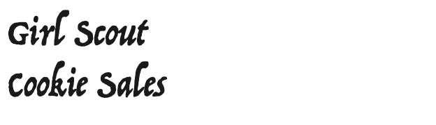
a) Trattatello: weak fit
Trattatello’s irregular, calligraphic strokes look handmade and slightly antique. Read from across a hallway, its uneven shapes blur, and its mood suggests a storybook rather than a sales chart.
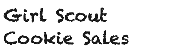
b) Chalkduster: defensible
There is a case for it: the audience is young and the tone is friendly, and chalk fits a school. But the gritty texture breaks the letters into specks, which costs legibility at a distance, and the joke wears thin on a chart whose job is numbers.
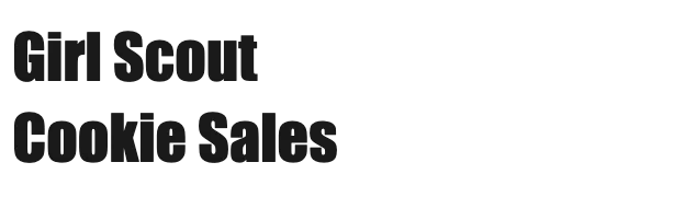
c) Impact: defensible
Heavy and compact, Impact carries across a room, which is what posters need. It is also condensed, crowded and associated with loud advertising and internet memes, so it shouts where a cheerful chart could simply speak.
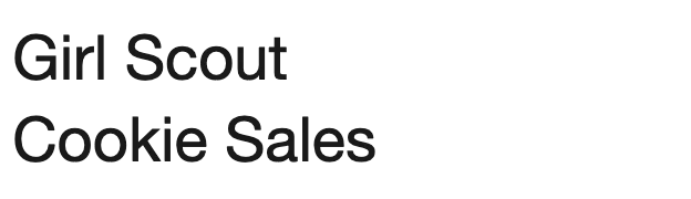
d) Helvetica Neue: suggested answer
The deck’s answer. A plain sans serif with even, regular shapes and a large x-height reads cleanly from a distance and matches the chart’s own labels. It adds no personality of its own, which suits a title whose job is to name the data. A bolder weight would carry even further.
2. A news site
A stock comparison will appear in an article on CNN.com, read on laptops and phones. Which title fits best?
Title preview
Choose a title below to see it here.
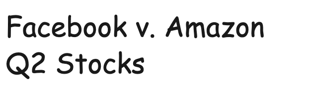
a) Comic Sans MS: weak fit
Comic Sans is legible, and some readers find its distinct letters easy, but its tone is casual and playful. On financial news it reads as unserious, and readers may doubt the numbers because of the voice.
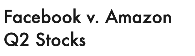
b) Futura: suggested answer
One of the deck’s two answers. A clean geometric sans looks modern, neutral and confident, as a news graphic should. Its small x-height and round shapes are less ideal at very small sizes, so a title size suits it better than labels.
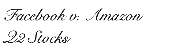
c) Snell Roundhand: weak fit
A formal script belongs on invitations. On a screen, at chart-title size, its thin joined strokes and ornate capitals are hard to read, and its elegance has nothing to do with a quarterly stock comparison.
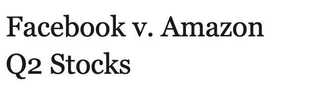
d) Georgia: suggested answer
The deck’s other answer. Georgia was drawn by Matthew Carter for Microsoft to read well on screens, and a serif headline carries the authority of print journalism. Notice its old-style figures: the 2 sits low, which is charming in a headline but would be a poor choice for the chart’s axis numbers.
3. A newspaper
Election results will be printed in a daily newspaper. Which title fits best?
Title preview
Choose a title below to see it here.
a) Rockwell: defensible
Slab serifs have a long history in newspaper headlines and posters, so this is not wrong. Rockwell is sturdy and readable, but its heavy, mechanical slabs feel more like a poster or a brand than the measured voice of a results page.
b) Marker Felt: weak fit
A marker face reads as a handwritten note. For election results, where readers look for accuracy and calm, it undercuts trust in the numbers.
c) Times New Roman: suggested answer
The deck’s answer, and a fitting one: Times New Roman was made for The Times of London and first printed in it in October 1932. A serif in this tradition matches the newspaper around it and sounds serious and credible. Any of the paper’s own headline faces would do as well.
d) Zapfino: weak fit
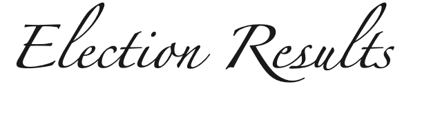
Zapfino is a showpiece of calligraphy, with long, looping strokes and tiny lowercase letters. It is beautiful at the right moment, and an election results chart is not that moment.
4. A magazine advertisement
An advertisement for a spa retreat will run in a magazine, over a photograph of misty mountains and palm trees. Which title fits best?
Title preview
Choose a title below to see it here.
a) Optima: defensible
Optima’s strokes swell slightly at the ends, like a serif without serifs, which gives it a calm, classical, slightly luxurious feel. It is a near-equal to Avenir Next, and many designers would choose it here; it is only a little more formal than the photograph.
b) Courier New: weak fit
A typewriter face suggests a form, a script or code. Its even, mechanical spacing works against the softness of the image, and its thin strokes disappear over a photograph.
c) Avenir Next: suggested answer
Close to the deck’s answer (a clean sans). Light, open and unhurried, it lets the photograph set the mood and adds a quiet, modern note of its own. Set with generous letter spacing, it suggests calm and space.
d) Papyrus: defensible
The deck marked this as a maybe, and many real spas have chosen it: it says natural and exotic at a glance. It has also become a cliché, the subject of a Saturday Night Live sketch about a film logo set in it, and its rough edges look cheap at large sizes. Defensible, but most designers would steer away.