Whole books cover each section of this page. It follows one thread, told for programmers: every technology changed what letters look like, and the choices a developer makes with fonts today, from a fallback stack to a variable weight, are the newest layer of that story. Two timelines give the overview.
1. Writing before printing
Letters take their shapes from the tools that make them, long before anyone prints them. In Mesopotamia, from about 3200 BCE, scribes pressed a cut reed into wet clay, and the result was cuneiform, writing made of wedges, because a wedge is what a reed leaves in clay. Egyptian hieroglyphs grew in the same centuries. In China, inscriptions on oracle bones from about 1200 BCE are the oldest large body of Chinese writing, and a continuous line leads from them to the Chinese and Japanese fonts on your phone.
The Phoenician alphabet, from about 1050 BCE, wrote consonants only; the Greeks adapted it and added vowels, and the Etruscans and Romans adapted the Greek. The same Phoenician source led, through Aramaic, to the Hebrew and Arabic scripts. Latin is one branch among many.
The Romans gave Latin type its capitals: the inscription at the base of Trajan's Column (113 CE) is still their model. Its letters end their strokes in small cross-strokes, serifs. Their origin is argued; one well-known theory holds that the letters were painted with a flat brush before the carver cut them. Either way, a tool shaped the letter.
Lowercase came from handwriting. In the late 700s, under Charlemagne, a clear, rounded book hand now called Carolingian minuscule spread across his empire, and its letters are the ancestors of most of the lowercase you are reading now. Later hands grew dense and angular as the blackletter of northern Europe, while fifteenth-century Italian humanists, taking Carolingian manuscripts for ancient Roman ones, revived the rounder hand. Both mattered when printing arrived.
A broad-nibbed pen held at a steady angle makes thick strokes in one direction and thin ones in another. That contrast, and the angle of its thin points, called stress, survive in nearly every serif typeface, centuries after the pen stopped being the tool.
2. Movable type in China and Korea
Printing started in East Asia, with whole pages. A woodblock printer carved a page in reverse into wood, inked it and pressed paper onto it. The oldest surviving dated printed book is a Diamond Sutra from a cave near Dunhuang, now in the British Library, dated to the equivalent of 11 May 868.
Movable type, a separate piece for each character, reassembled for each page, is recorded first in China too. The scholar-official Shen Kuo, in the Dream Pool Essays of the 1080s, describes how a commoner named Bi Sheng, in the Qingli reign period (1041 to 1048), carved characters in clay, fired them, and set them in an iron frame on a bed of resin, wax and paper ash. No Bi Sheng type survives. Around 1300 the official Wang Zhen had wooden type carved for a local gazetteer, tens of thousands of pieces kept on revolving tables so that a compositor could turn the characters toward him.
That table points at the central fact of Chinese printing. Ordinary text needs thousands of distinct characters, so a font of movable type is a warehouse, not a drawer. For most books woodblocks were cheaper: a skilled carver cut a page quickly, blocks could be stored and reprinted on demand, and no one had to sort tens of thousands of pieces back into place. Movable type was used, sometimes on a grand scale for official projects, but woodblocks remained the main method in China into the nineteenth century: a sensible choice for the script, not a failure to see an idea.
Metal type in Korea
Korea cast type in metal. The oldest surviving book printed with movable metal type is a Buddhist anthology known as Jikji, printed at Heungdeok Temple near Cheongju in 1377. The Bibliothèque nationale de France, which holds the only known copy of the metal-type edition (its second volume), describes it as the oldest known book printed with movable metal type, 78 years before the Gutenberg Bible. It was inscribed on UNESCO's Memory of the World Register in 2001.
Korea also produced something no printer could: a script designed on purpose. In 1443 King Sejong completed Hangul, an alphabet for Korean, and in 1446 it was promulgated in the Hunminjeongeum, "the proper sounds for instructing the people." Its consonant shapes reflect how the mouth makes their sounds, and its letters group into square syllable blocks: ㅎ, ㅏ and ㄴ stack into 한. Unicode encodes all 11,172 combinations of 19 initial consonants, 21 vowels and 28 finals (counting none), arranged so that a syllable's code point can be computed from its parts.
3. Gutenberg's system
In Mainz, around 1450, Johannes Gutenberg put together a system whose parts mattered as much as the idea: a hand mould that cast each piece of type, called a sort, so that every e was identical and could be cast by the hundred; a type metal of lead, tin and antimony; an oil-based ink that stuck to metal; and a screw press adapted from presses for wine and paper. His Bible, finished by about 1455, is called the 42-line Bible after the lines in each column.
Its type imitated the blackletter of the scribes it replaced. Library and museum sources give its font as about 290 different sorts, many times the letters of the alphabet, because a page that looked like a manuscript needed variant forms, ligatures and abbreviations. The lesson travels: a font is not an alphabet but a set of glyphs, and OpenType fonts still carry ligatures and alternates for the same reason.
Why the press spread in Europe
Gutenberg was not first, but within decades there were presses across Europe. Paper was available, cities and universities wanted books, printers competed, and a Latin font was small. A few hundred sorts fitted in a printer's cases, where a Chinese font needed thousands. The size of the script made movable type cheap in one place and expensive in another, a better explanation than any claim that one region "won," and one that returns on the web, where a Latin font is tens of kilobytes and a Chinese one can be megabytes.
Upper and lower case
A compositor set type by hand from a pair of wooden cases, trays divided into compartments. Capitals, needed less often, were kept in the upper case; small letters in the lower case, nearer the hand, with the largest compartments for the most frequent letters. That is why small letters are lowercase and capitals are uppercase; Merriam-Webster dates both words in this sense to 1683, the year of Joseph Moxon's printing manual.
The print shop's vocabulary is all over CSS. Font comes from French fonte, a casting: a set of sorts cast together. Leading was strips of lead placed between lines to space them, the ancestor of line-height. The em was a square piece of type as wide as the type was tall, named for the capital M; CSS's em unit is still "the size of the type." The diagram's fi and fl ligatures are what font-variant-ligatures turns on and off. And a 12-point font was a body of metal 12 points tall, which is why font-size measures the body, not any letter, a point the next page takes up.
4. The roman and the italic
Printing reached Italy within a generation, and Italian readers wanted the humanist hand, not blackletter. In Venice in 1470 the French-born printer Nicolas Jenson printed with a roman type of great clarity based on that hand, and designers have revived his letters ever since. Roman is still the name for the upright style of a typeface.
The italic began as a separate typeface, not a slanted version of a roman. The Venetian publisher Aldus Manutius wanted small, affordable books of the classics, and in 1501 his Virgil was set in a narrow, space-saving type based on chancery handwriting, cut by Francesco Griffo. Only later did printers pair italics with romans for emphasis.
That origin explains a piece of CSS. A true italic has different letter shapes (compare the a and f in a serif italic), so font-style: italic asks for a different font file, and when none exists the browser slants the roman, a "faux italic" a designer will spot at once. Fonts in CSS, page 05 of this section, explains font-synthesis and how to prevent it. Whether a word should be italic at all is a question of meaning (text-level semantics).
Garamond, and a lesson about names
In sixteenth-century Paris, Claude Garamond, who died in 1561, cut roman types that set the standard for European printing for generations. Yet several early-twentieth-century "Garamond" revivals were modelled on types cut a century later by Jean Jannon, long misattributed, until Beatrice Warde, writing as "Paul Beaujon," showed the error in 1926. The lesson for anyone choosing fonts: the name in a font menu is a brand, not a provenance.
 Hoefler Text
 Palatino
5. From old style to Didone
For three centuries the letter changed slowly, each change following the materials. In London, William Caslon issued his famous specimen sheet in 1734; his sturdy, plain types were used widely in Britain and its American colonies. With Garamond and Jenson they belong to the old-style serifs: low to moderate contrast, stress tilted like a pen's, serifs that blend into the strokes with curved brackets.
In Birmingham, John Baskerville wanted sharper printing than his tools allowed, so he changed the tools: his 1757 Virgil used his own type, a smooth "wove" paper made by James Whatman, and inks and pressing meant for a crisp impression. His letters have more contrast, more vertical stress and sharper serifs than Caslon's. Type historians call such faces transitional: between old style and what came next.
Then came the most extreme contrast metal could hold. From the 1780s the Didot family in Paris and Giambattista Bodoni in Parma cut types with hairline thins, heavy thicks, vertical stress and flat, unbracketed serifs. Bodoni's Manuale tipografico, a vast specimen book unfinished when he died in 1813, was completed and published by his widow in 1818. These faces were called "modern" in their time and are often called Didone, a name joining Didot and Bodoni. On rough paper or at small sizes the hairlines break up, a weakness that returns on low-resolution screens.
 Big Caslon
 Baskerville
 Didot
 Bodoni 72
These names return as a classification in Anatomy and vocabulary. Here the point is narrower: each step became possible when paper, ink and presses could reproduce a finer line.
6. Shouting: the nineteenth century
The industrial nineteenth century wanted type to sell things, readable across a street, and founders answered with type that was big and loud: fat faces, Didones made enormously heavy; slab serifs, with thick rectangular serifs, which the London founder Vincent Figgins showed as "Antique" in a specimen dated 1815 (its paper suggests a year or two later) and which were soon also called Egyptians; and type with no serifs at all. William Caslon IV, a descendant of the first Caslon, showed a capitals-only sans-serif in 1816, and by the 1830s sans-serifs were common enough to be sold as grotesques, a name that says what many thought of them.
Wood made big type affordable: in the United States Darius Wells began cutting wood type by machine in the 1820s, which is why nineteenth-century posters could mix a dozen faces and sizes on one sheet.
Then machines set the text. Ottmar Mergenthaler's Linotype, which cast a whole line at a time from a keyboard, went into use at the New-York Tribune in July 1886, and the Monotype system, which cast single sorts from a punched paper ribbon, followed. These machines needed their own versions of every typeface, and type companies became something like software platforms: a face not made for your machine was a face you could not use. Monotype's Times New Roman, made for The Times of London under Stanley Morison's direction and first used in October 1932, was a hot-metal newspaper face before it became the default serif of personal computers.
 Superclarendon
 Rockwell
 Times New Roman
7. Geometry, neutrality and the numbered family
In the early twentieth century, sans-serif type became a cause: designers around the Bauhaus and the "new typography" in Germany wanted letters built from simple forms for an industrial world. Futura, designed by Paul Renner and released by the Bauer foundry in 1927, is the classic geometric sans: an o that is nearly a circle, pointed capitals, strokes of almost even weight. In Britain, Edward Johnston's lettering for the London Underground (1916) and Eric Gill's Gill Sans for Monotype (1928) took a more humanist route, with proportions closer to classical roman letters.
After the Second World War, Swiss designers built the International Typographic Style: grids, asymmetric layouts and sans-serif type meant to be neutral. Two typefaces of 1957 came out of it. At the Haas foundry near Basel, Eduard Hoffmann directed Max Miedinger in reworking the 1890s Akzidenz-Grotesk into Neue Haas Grotesk, renamed Helvetica (Latin for Swiss) in 1960 when the Stempel foundry and Linotype took it up; it went on to sign subways and airlines. In Paris, Adrian Frutiger designed Univers for Deberny & Peignot.
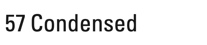
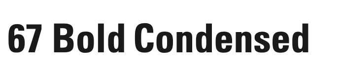
Univers deserves a programmer's second look. Frutiger planned it as a system: 21 styles on a grid of weights and widths, named not "Bold Condensed" but with numbers. Univers 55 is the regular; the tens digit is the weight, so 65 is bolder and 45 lighter, and the units digit is the width and posture, so 57 is condensed and 56 is oblique. Deberny & Peignot also offered it for the Lumitype, an early phototypesetting machine. CSS later took a similar path with weights from 100 to 900 and widths as percentages, and variable fonts made the grid continuous. The numbers are not inherited from Univers, but the idea is the same: a family is a coordinate system.
 Futura
 Gill Sans
 Helvetica
 Univers
 Univers 45
 Univers 55
 Univers 65
 Univers 57
 Univers 67
8. Film, code and PostScript
Metal had limits: every size was a separate font, and letters could not overlap. Phototypesetting replaced metal with light, projecting letters from a film negative through lenses onto photographic paper, so one master served every size and letters could be spaced as tightly as a designer liked. The French engineers René Higonnet and Louis Moyroud developed the Lumitype, sold in the United States as the Photon, and the first complete book composed on it, The Wonderful World of Insects, appeared in 1953. By the 1970s film had replaced metal in most of the industry, and faces were redrawn again, some losing quality in the move.
Computer science enters through one unhappy author. In 1977 Donald Knuth found the phototypeset proofs of a new edition of The Art of Computer Programming inferior to the old metal, and set out to write his own typesetting system, TeX, with METAFONT, a language that describes letters as programs with parameters such as stroke width. TeX still sets most mathematics.
Outlines, printers and desktop publishing
Digital type turned letters into data. PostScript, the page description language Adobe released in 1984, described each letter as an outline made of straight lines and cubic Bézier curves, which a printer could fill at any size and any resolution. In January 1985 Apple announced the LaserWriter, a laser printer with PostScript built in, and that summer Aldus shipped its layout program PageMaker; Aldus's founder Paul Brainerd is usually credited with the name desktop publishing. An office could now design a page on a screen and print it with real type, and professional typesetting lost its monopoly within a decade.
The Macintosh, launched in 1984, came with bitmap fonts drawn pixel by pixel by Susan Kare and named after cities, among them Chicago, Geneva and New York. It also put a font menu in front of millions of people who had never chosen type, and the arguments about which to use date from here.
Adobe kept the specification of its high-quality Type 1 fonts to itself at first, and Apple answered with TrueType, which it shipped in System 7 in 1991 and licensed to Microsoft, which added it to Windows 3.1 in 1992. The "font wars" ended in compromise: on 10 September 1996 Microsoft and Adobe announced OpenType, one format that could hold either kind of outline, with room for Unicode and for typographic features such as ligatures and alternates. Every font a browser loads today is an OpenType font in some wrapper. Adobe's Multiple Master fonts (1991), with design axes to interpolate between, and Apple's TrueType GX variations did not catch on, but both are ancestors of variable fonts. Web fonts and performance shows what is inside a font file: the glyf table holds TrueType's quadratic outlines and CFF PostScript's cubic ones, side by side in one format.
9. Type on screens
Printers of the 1980s and 1990s had hundreds of dots per inch; screens had about 72 to 96 pixels per inch, so a letter at text size was a handful of pixels tall. Three techniques kept screen type readable, and each changed how letters looked.
- Bitmap fonts: letters drawn as pixels at each size, sharp but fixed to the sizes someone drew.
- Hinting: small programs inside the font that move outline points onto the pixel grid, so stems come out whole pixels wide. Good hinting was slow, skilled hand work.
- Anti-aliasing: gray pixels where the outline covers part of a pixel, trading sharpness for smoother shapes. Microsoft's ClearType, announced in November 1998 and shipped in Windows XP in 2001, added subpixel rendering, treating an LCD pixel's red, green and blue stripes as three narrower pixels.
Verdana, Georgia and the Core fonts
Microsoft's answer for the young web was typefaces made for the screen. Matthew Carter, whose career ran from cutting metal punches by hand to digital type, designed Verdana, a sans-serif, and Georgia, a serif, both hand-hinted by Tom Rickner and others at Monotype. Microsoft dates Verdana's first availability to 8 July 1996 and Georgia's to later that year. Carter began from the pixels, designing bitmaps for the screen sizes and building the outlines around them.
The results show their medium. Verdana is wide, with a large x-height and loose spacing so letters do not collide, and Microsoft notes that easily confused characters, such as i, j, l, I and 1, were drawn to be distinct. Georgia, after the Scotch Roman types of the early nineteenth century, has a large x-height, sturdy serifs and lighter capitals. Both look a little coarse in print: they are designs for a technology.
 Verdana
 Georgia
Microsoft gave these and others away as Core fonts for the Web: Andale Mono, Arial, Arial Black, Comic Sans MS, Courier New, Georgia, Impact, Times New Roman, Trebuchet MS, Verdana and Webdings. The project ran from 1996 until August 2002, by which time the fonts were on most computers and had become the web's shared vocabulary.
The old advice "serif for print, sans-serif for screen" comes from this era, and it was a fair tendency then: hairlines fell apart at 96 pixels per inch. Screens of two or three times the density, from the iPhone 4 in 2010 onward, removed most of the reason. On a sharp screen a well-made serif reads as well as a sans, and the choice is about voice and context, which Choosing and pairing takes up.
10. The web-safe years
Early HTML had no say in type. Netscape added a <font> element, and pages filled with it:
CSS moved type into style sheets, but it could only name fonts, and a name worked only if the reader's computer had that font. So designers learned the short list of web-safe fonts and wrote stacks that hoped for the best:
It was not for lack of a standard. @font-face was in CSS2, a W3C Recommendation in 1998. Internet Explorer implemented it from version 4 with Embedded OpenType (EOT), a compressed format that could be locked to particular sites, made with Microsoft's free WEFT tool; Netscape 4 used Bitstream's TrueDoc. No format was shared, foundries feared that a font on a web server was a font anyone could copy, and CSS 2.1 removed @font-face to match what browsers did (Web fonts and performance quotes the change).
Hacks that filled the gap
Designers who needed a brand face worked around the gap, at a cost:
- Images of text. Headings exported as GIFs looked right, but a screen reader got only the
alttext, if any, and the text could not be selected, searched, translated or enlarged without blurring. WCAG still asks for real text where possible (Accessibility). - sIFR (Scalable Inman Flash Replacement), released in 2004 by Mike Davidson from an idea of Shaun Inman's, swapped headings for small Flash movies that drew the text in an embedded font. The real text stayed in the HTML, but it needed the Flash plugin and died with it.
- Cufón and typeface.js, in the late 2000s, turned fonts into JavaScript data and drew headings with canvas or vector graphics: no plugin, but the result behaved like a picture of text, and converting a commercial font often broke its license.
11. The return of web fonts
The thaw began with Safari 3.1 in 2008, which loaded ordinary TrueType and OpenType files through @font-face; Firefox 3.5 followed in 2009, and Chrome soon after. Ordinary font files revived the foundries' fear, and the answer came in two forms.
- Services. Typekit, launched in 2009 and later bought by Adobe, served licensed fonts from its own servers, so foundries could license fonts to the web without handing out files. On 19 May 2010 Google announced the Google Font API and directory of open-source fonts, now Google Fonts, free to use. Services also raised privacy questions (Web fonts and performance).
- A web format. WOFF, the Web Open Font Format, was drafted in 2009 by Jonathan Kew of Mozilla with the type designers Tal Leming and Erik van Blokland: the same font tables, compressed, with room for license metadata, and plainly meant for the web rather than for installing. It was submitted to the W3C in April 2010, became a Recommendation in 2012, and was followed by WOFF2 with better compression in 2018.
The formats themselves, and why WOFF2 alone is enough today, are in Web fonts and performance. The bigger change was cultural: in a few years the web went from a dozen shared fonts to thousands, and the question moved from "which font will they have" to "how many should a page load, how fast, and who learns about the visit."
Variable fonts
In September 2016, at the ATypI conference in Warsaw, Apple, Google, Microsoft and Adobe jointly presented OpenType 1.8, which added font variations: one file holding a design space along axes such as weight and width, from which any point can be drawn. It built on Apple's TrueType GX variations of the 1990s, with Multiple Master's idea behind both. Variable fonts, page 08 of this section, covers the CSS.
12. Full circle: the system font
As interfaces became the main place people read, operating systems got their own typefaces, tuned for small sizes and many languages. Microsoft's Segoe UI became the Windows interface face with Windows Vista; Google's Roboto arrived with Android 4.0 in 2011; and Apple's San Francisco, first seen on the Apple Watch, replaced Helvetica Neue as the system font of iOS 9 and OS X El Capitan in 2015. A page that uses them downloads nothing.
Sites such as GitHub, in 2017, began setting their interfaces in the system font with stacks naming each platform's face, and CSS added a generic family, system-ui, meaning "the operating system's interface font":
So web type has come full circle, with a difference: in 2005 a page used the reader's fonts because it had to; today it can choose them because they are fast, private and familiar. Fonts in CSS, page 05, covers the generic families.
A font stack is itself a small history. Read this one from right to left and it runs from whatever the device has, through a hot-metal newspaper face and a 1990s screen face, to a web font:
13. Every script
For most of computing a font covered one script, and other text showed up as boxes or question marks. Unicode, whose version 1.0 appeared in 1991, gave every character of every script one number, so that one fallback chain could cover any text. Other scripts have type histories of their own, and they show the same rule: the technology shapes the letters, and sometimes the letters resist the technology.
Arabic
Arabic is written right to left, joined, and most letters change shape by position. The letter ʿayn shows four forms: ع alone, عـ at the start of a word, ـعـ in the middle and ـع at the end. Calligraphers had refined it for centuries, with ligatures and stacked letters no case of sorts could reproduce. The first book in Arabic movable type, a Christian book of hours printed in Fano, Italy, in 1514, was crude beside a manuscript. In Istanbul, İbrahim Müteferrika's press, the first in the Ottoman Empire run by a Muslim to print in Arabic script, opened in 1727, and its first book, a dictionary, appeared in 1729. Why printing in Arabic script came so late in the Islamic world is debated, with reasons from calligraphers' livelihoods and religious caution to a manuscript culture that worked well; one practical reason is visible in the letters themselves.
Metal and machines pushed Arabic type toward simplified forms. Digital type finally fitted the script: an OpenType font carries the contextual forms and ligatures as glyphs, and a shaping engine in the browser picks one for each position. The character in the text never changes; the glyph does. That distinction between characters and glyphs is the same one Gutenberg's 290 sorts made, and it is why letter-spacing breaks joined scripts, a problem Type for people, page 10, comes back to.
Chinese, Japanese and Korean
Wang Zhen's warehouse problem moved into the font file. When Adobe and Google released the open-source Pan-CJK typeface Source Han Sans in 2014 (Google's version is Noto Sans CJK), each weight held 65,535 glyphs, the most an OpenType font can hold, because glyphs are numbered with 16-bit integers. A full CJK font runs to megabytes, which is why such fonts are split or subset (Web fonts and performance). The same character can also need different glyphs in Chinese and Japanese, so lang matters for font selection (CSS for people).
No more tofu
The empty box drawn for a character no font can show is nicknamed tofu. Google began the Noto project with Monotype in 2012, named for "no more tofu," and in October 2016 announced a family covering more than 800 languages and over 100 scripts, under the SIL Open Font License. Noto is one reason a browser can usually draw any character it meets, and a reminder that most of the world does not write in Latin letters.
14. What each technology did to the letters
A pattern runs through the story: each new medium first imitated the one before, then found the shapes it was good at, then left habits that outlived it.
| Technology | What it did to letters | What remains |
|---|---|---|
| Chisel and brush | Serifs and the proportions of Roman capitals | Every serif typeface; the classical capital |
| Broad pen | Contrast and stress; lowercase from fast hands; italic from chancery writing | font-style: italic as a separate design, not a slant |
| Woodblock and movable type in East Asia | Whole pages carved for large scripts; type for big projects | Fonts measured in megabytes; unicode-range and subsetting |
| Cast metal type | Identical sorts, ligatures, fixed sizes, a family as a set of separate fonts | The words font, leading, em, uppercase, lowercase; font-size as the body, not the letter |
| Industrial printing and wood type | Heavy display faces, slabs, sans-serifs | Display versus text faces; the grotesques behind Helvetica and Arial |
| PostScript and TrueType | Letters as Bézier outlines; type for everyone | OpenType files with glyf or CFF outlines |
| Low-resolution screens | Bitmaps, hinting, anti-aliasing; wide, open faces like Verdana | The "sans on screen" habit, now a tendency rather than a rule |
| The web without font downloads | A dozen shared fonts; text as images and plugins | Font stacks that end in a generic family |
| Web fonts | Thousands of faces on any page | @font-face, WOFF2, font-display, budgets |
| Unicode and Noto | Fonts and fallbacks for every script | Per-character fallback; lang and shaping |
The habit worth keeping is a question to ask of any typeface: what was it made for? Using a face where its medium's strengths apply is half of choosing type well.
15. Summary
| Concept | Key points |
|---|---|
| The theme | Every technology changed the letters: clay, chisel, pen, metal, film, outlines, pixels. CSS still uses the print shop's words. |
| Before printing | Writing from about 3200 BCE; Chinese characters; the alphabet from Phoenician to Latin; Roman capitals, Carolingian minuscule, blackletter. |
| East Asia | Woodblocks (Diamond Sutra, 868); Bi Sheng's clay type (1040s, per Shen Kuo); Jikji (1377), oldest surviving metal-type book; Hangul (1446). Large character sets kept woodblocks practical. |
| Gutenberg | Mainz, about 1450: mould, type metal, ink, press; about 290 sorts. A small alphabet made fonts cheap. |
| Upper and lower case | Capitals in the upper case, small letters in the lower. Font, leading and em come from the same shop. |
| Serif families | Jenson's roman (1470); Griffo's italic (1501), a separate design; Garamond; Caslon (old style), Baskerville (transitional), Didot and Bodoni (Didone). |
| Industrial type | Fat faces, slabs and grotesques; wood type; Linotype (1886); Times New Roman (1932). |
| Modern sans | Futura (1927), Gill Sans (1928); Helvetica and Univers (1957); a family as a numbered coordinate system. |
| Film and digital | Phototype (1953); TeX and METAFONT; PostScript (1984) and desktop publishing (1985); TrueType (1991); OpenType (1996). |
| Screens | Bitmaps, hinting, anti-aliasing. Verdana and Georgia (1996); Core fonts for the Web (1996–2002). "Sans for screens" was a low-resolution tendency. |
| The web | @font-face in CSS2 (1998), dropped from 2.1; images of text and sIFR; back from 2008; Typekit, Google Fonts, WOFF; variable fonts (2016); system-ui. |
| Every script | Unicode (1991); Arabic shaping; CJK fonts at the 65,535-glyph ceiling; Noto. |